
Staying current on the top web design trends and standards is very important for a designer or a developer. Currently, background gradients are widely used in modern websites.
In this article, we'll walk you through different background gradients examples using CSS.
Background Gradients Using CSS
The CSS gradient displays a smooth transition using two or more specified colors. CSS gradient provides better control and performance over using an actual image (of a gradient) file. The background-image CSS property is used to declare gradients as a background.
There are three types of gradients: linear (created with the linear-gradient() function), radial (created with radial-gradient() function), and conic (created with the conic-gradient() function). Also, you can create repeating gradients with the repeating-linear-gradient(), repeating-radial-gradient(), and repeating-conic-gradient() functions.
MDN Docs defines these functions as:
linear-gradient(): The linear-gradient() CSS function creates an image consisting of a progressive transition between two or more colors along a straight line. Its result is an object of the <gradient> data type, which is a special kind of <image>.
radial-gradient(): The radial-gradient() CSS function creates an image consisting of a progressive transition between two or more colors that radiate from an origin. Its shape may be a circle or an ellipse. The function's result is an object of the <gradient> data type, which is a special kind of <image>.
conic-gradient(): The conic-gradient() CSS function creates an image consisting of a gradient with color transitions rotated around a center point (rather than radiating from the center). Example conic gradients include pie charts and color wheels. The result of the conic-gradient() function is an object of the <gradient> data type, which is a special kind of <image>.
repeating-linear-gradient(): The repeating-linear-gradient() CSS function creates an image consisting of repeating linear gradients. It's similar to gradient/linear-gradient() and takes the same arguments, but it repeats the color stops infinitely in all directions so as to cover its entire container. The function's result is an object of the <gradient> data type, which is a special kind of <image>.
repeating-radial-gradient(): The repeating-radial-gradient() CSS function creates an image consisting of repeating gradients that radiate from an origin. It's similar to gradient/radial-gradient() and takes the same arguments, but it repeats the color stops infinitely in all directions so as to cover its entire container, similar to gradient/repeating-linear-gradient(). The function's result is an object of the <gradient> data type, which is a special kind of <image>.
repeating-conic-gradient(): The repeating-conic-gradient() CSS function creates an image consisting of a repeating gradient (rather than a single gradient) with color transitions rotated around a center point (rather than radiating from the center).
Here's the official syntax of each type of gradient.
Official Syntax of Linear Gradients
linear-gradient(
 [ <angle> | to <side-or-corner> ]? ,
 <color-stop-list>
)
<side-or-corner> = [to left | to right] || [to top | to bottom]
Official Syntax of Radial Gradients
radial-gradient(
 [ <ending-shape> || <size> ]? [ at <position> ]? ,
 <color-stop-list>
);
Official Syntax of Conic Gradients
conic-gradient(
 [ from <angle> ]? [ at <position> ]?,
 <angular-color-stop-list>
)
Here are some awesome background gradient examples that can enhance the UI of your website to the next level.
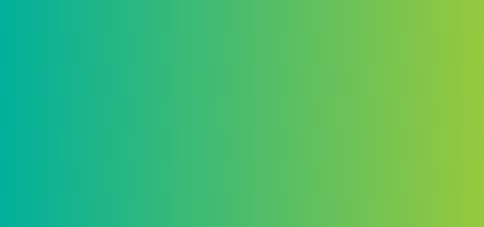
1. Dusty Grass
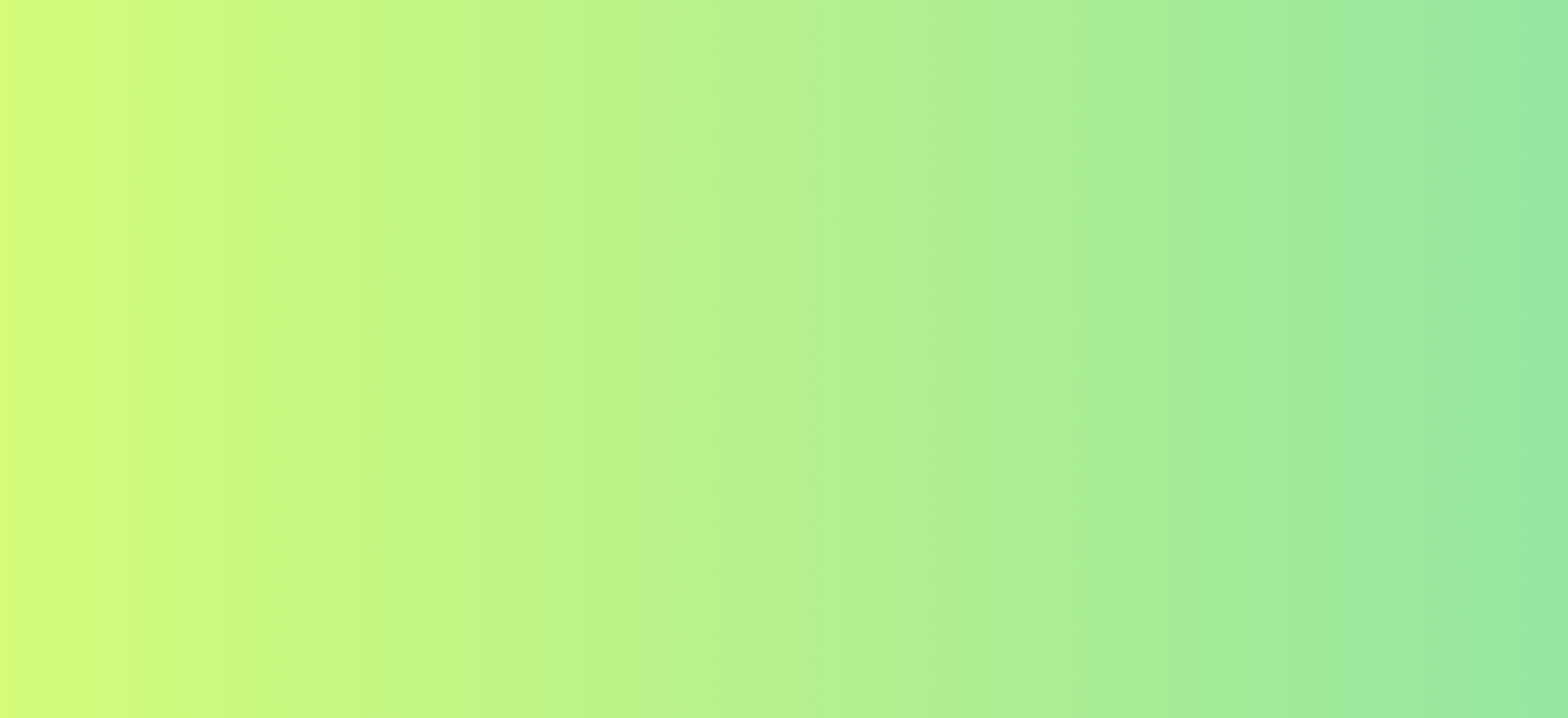
Use the following CSS to create the above gradient:
background-image: linear-gradient(120deg, #d4fc79 0%, #96e6a1 100%);2. Sand to Blue
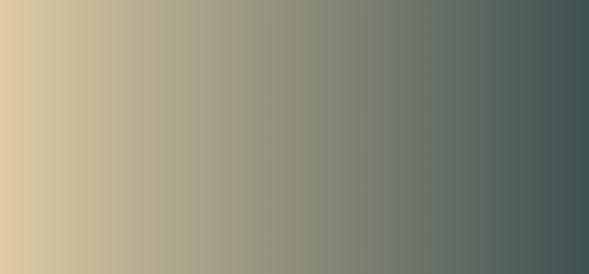
Use the following CSS to create the above gradient:
background-image: linear-gradient(to right, #DECBA4, #3E5151);3. Kye Meh
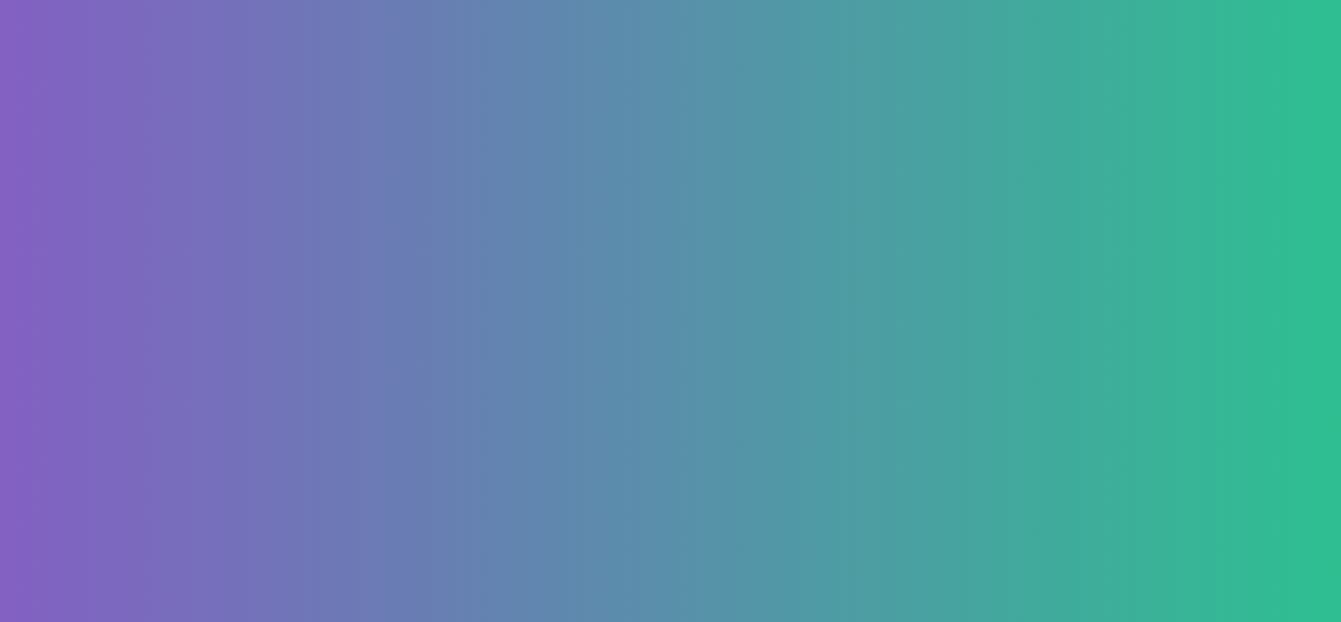
Use the following CSS to create the above gradient:
background-image: linear-gradient(to right, #8360c3, #2ebf91);4. Amin
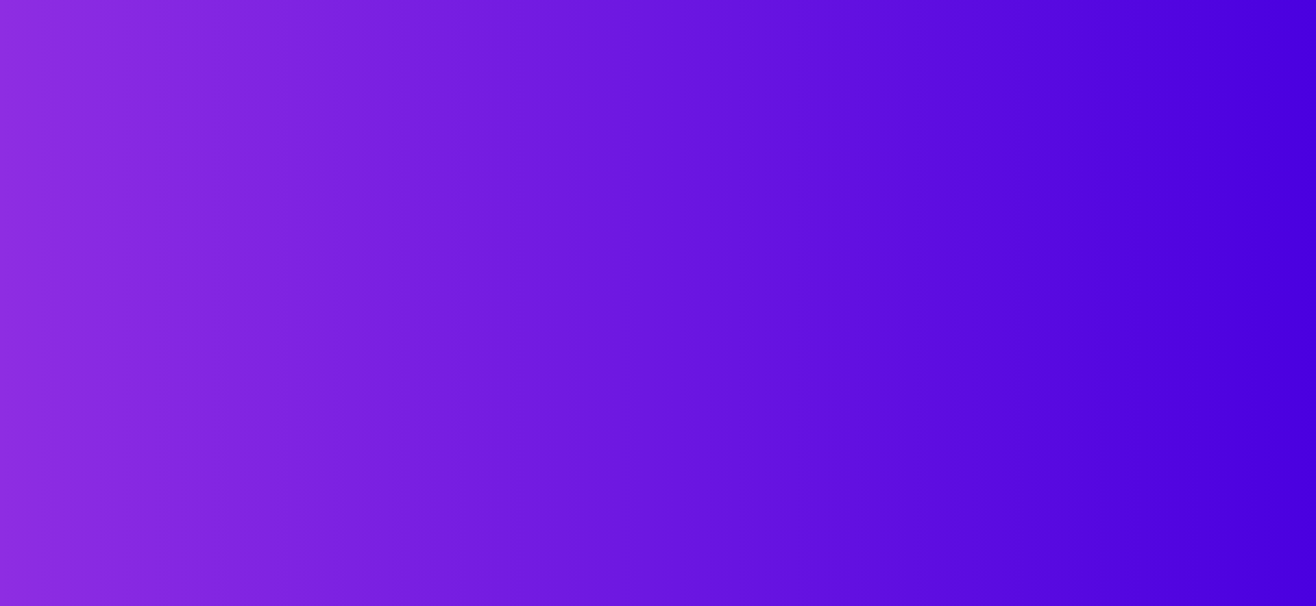
Use the following CSS to create the above gradient:
background-image: linear-gradient(to right, #8e2de2, #4a00e0);5. Relaxing Red
Use the following CSS to create the above gradient:
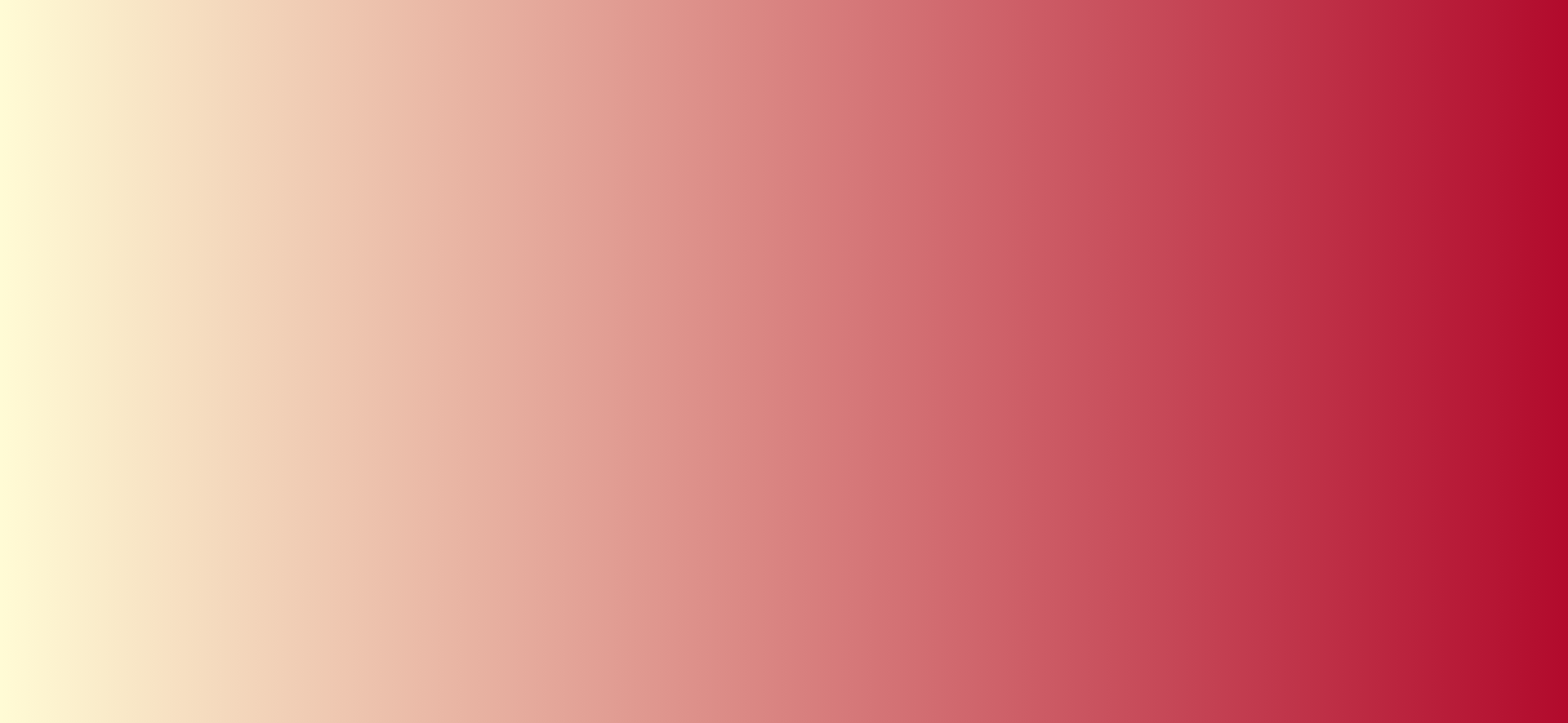
background-image: linear-gradient(to right, #fffbd5, #b20a2c);6. Sublime Light
Use the following CSS to create the above gradient:
background-image: linear-gradient(to right, #fc5c7d, #6a82fb);7. Megatron
Use the following CSS to create the above gradient:
background-image: linear-gradient(to right, #c6ffdd, #fbd786, #f7797d);8. Blue Raspberry

Use the following CSS to create the above gradient:
background-image: linear-gradient(to right, #00b4db, #0083b0);9. Premium Dark

Use the following CSS to create the above gradient:
background-image: linear-gradient(to right, #434343 0%, black 100%);10. Crystalline
Use the following CSS to create the above gradient:
background-image: linear-gradient(-20deg, #00cdac 0%, #8ddad5 100%);11. Lawrencium

Use the following CSS to create the above gradient:
background-image: linear-gradient(to right, #0f0c29, #302b63, #24243e);
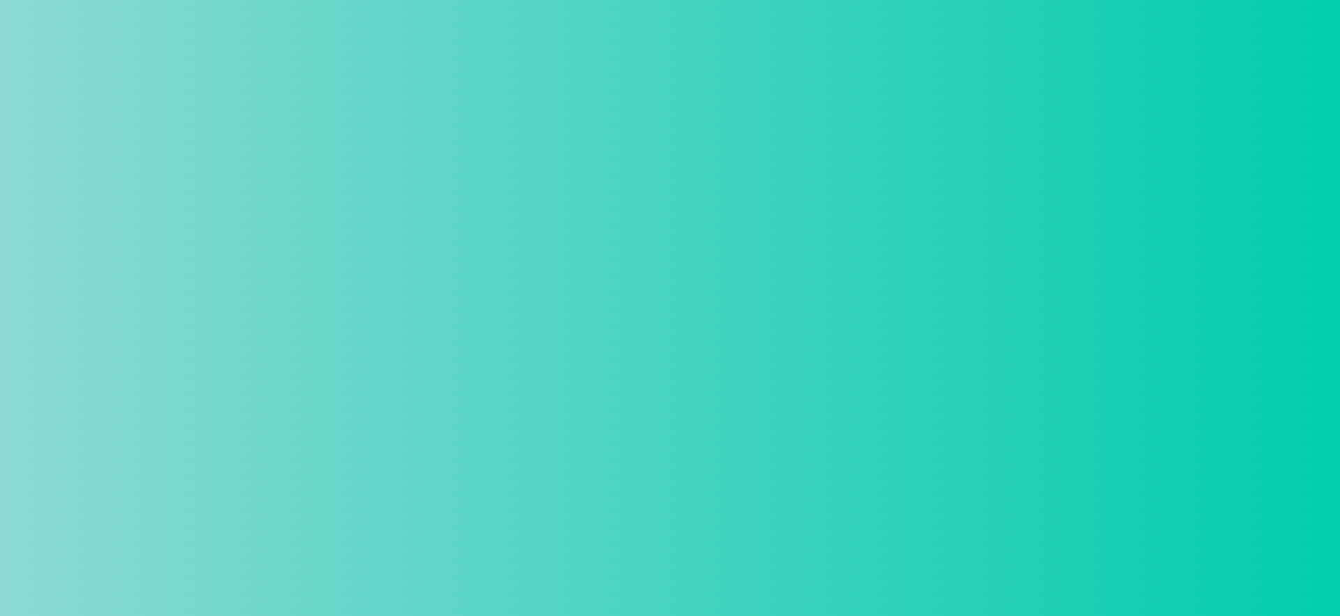
12. Ohhappiness
Use the following CSS to create the above gradient:
background-image: linear-gradient(to right, #00b09b, #96c93d);13. The Strain
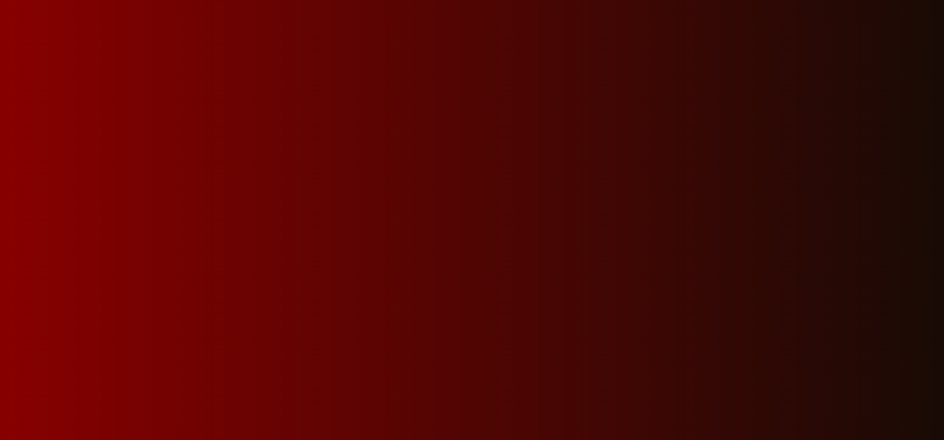
Use the following CSS to create the above gradient:
background-image: linear-gradient(to right, #870000, #190a05);14. Yellow Mango
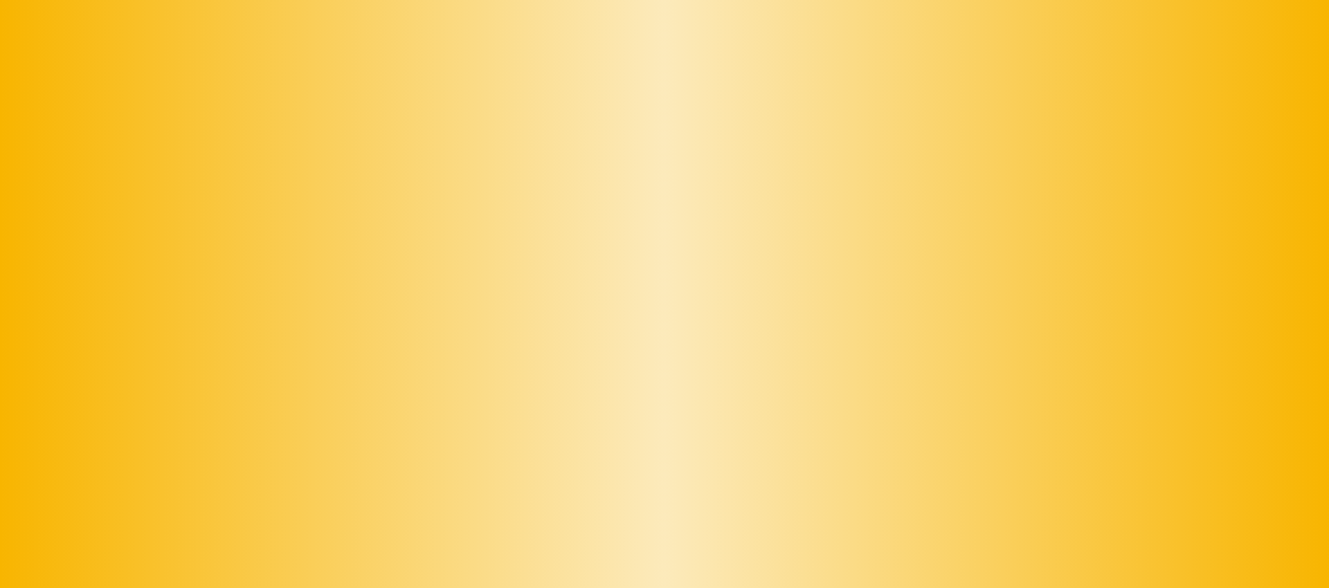
Use the following CSS to create the above gradient:
background-image: radial-gradient(circle farthest-side, #fceabb, #f8b500);
15. Juicy Grass

Use the following CSS to create the above gradient:
background-image: radial-gradient( circle 759px at -6.7% 50%, rgba(80,131,73,1) 0%, rgba(140,209,131,1) 26.2%, rgba(178,231,170,1) 50.6%, rgba(144,213,135,1) 74.1%, rgba(75,118,69,1) 100.3% );16. Pink Fish
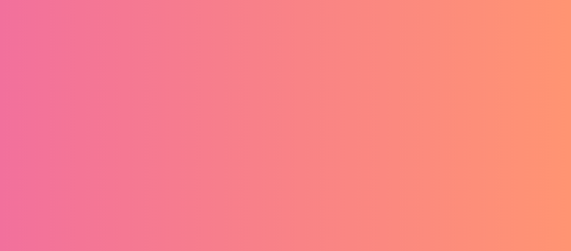
Use the following CSS to create the above gradient:
background-image: linear-gradient(to right, rgb(242, 112, 156), rgb(255, 148, 114));
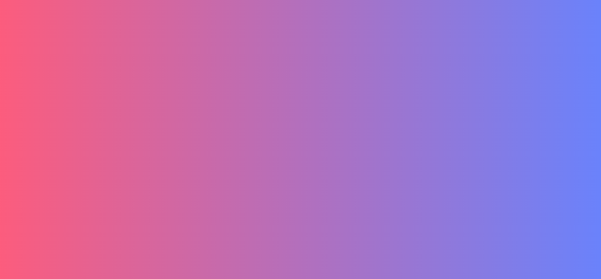
17. Sea Lord

Use the following CSS to create the above gradient:
background-image: linear-gradient( 109.6deg, rgba(156,252,248,1) 11.2%, rgba(110,123,251,1) 91.1% );18. Cherry Blossom
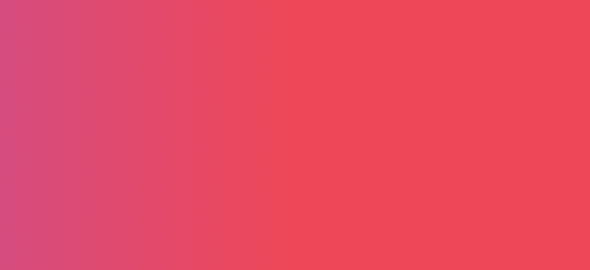
Use the following CSS to create the above gradient:
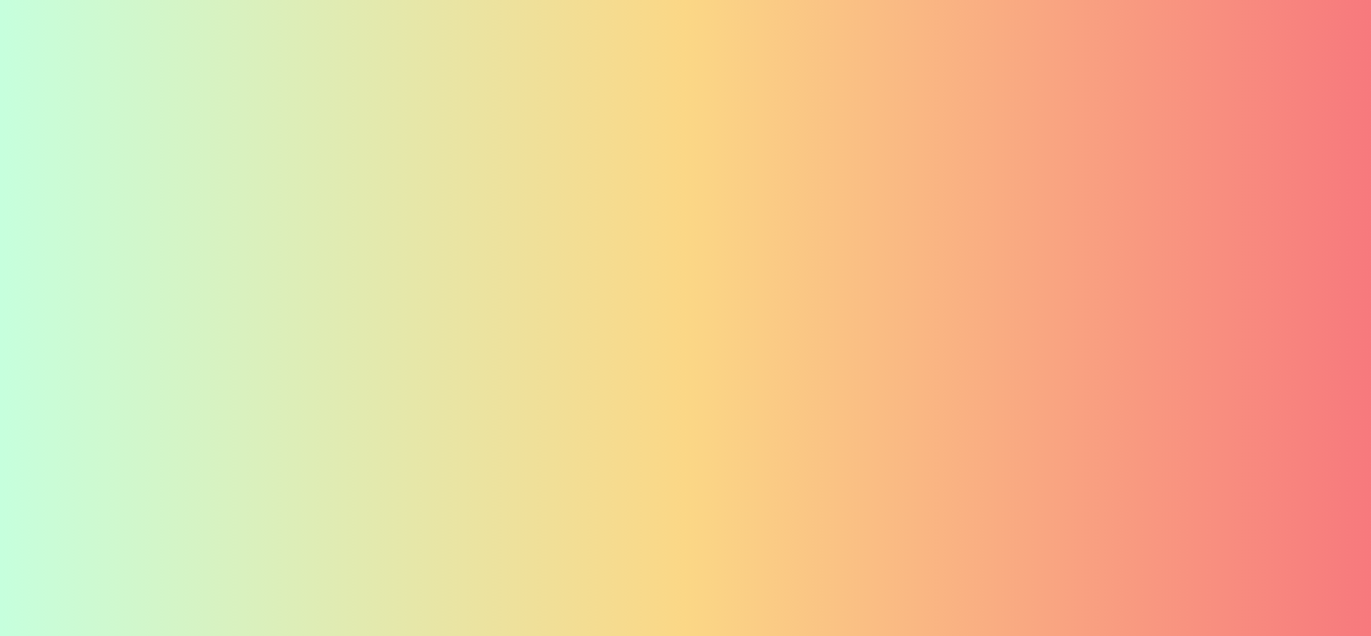
background-image: linear-gradient(25deg,#d64c7f,#ee4758 50%);19. Fresh Air

Use the following CSS to create the above gradient:
background-image: linear-gradient( 95.2deg, rgba(173,252,234,1) 26.8%, rgba(192,229,246,1) 64% );


0 Comments